
Painting
9 Interior Paint Colors That Make Rooms Feel Larger and Brighter
The right paint color can make a cramped room feel open and a dim room feel sunlit. Here are nine shades that actually work, and how to pick them.
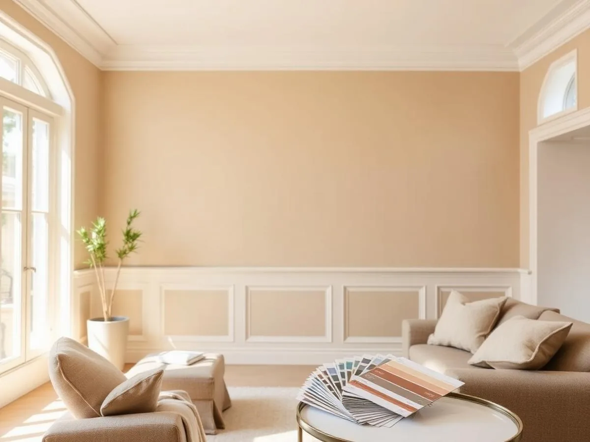
Why paint color changes how big a room feels
If you've ever walked into a builder-grade beige room and felt instantly boxed in, you already understand the problem this article solves. Color choice is often the single cheapest lever homeowners have for changing how a space feels, far cheaper than knocking down a wall or adding a window, and yet it's routinely treated as an afterthought squeezed in at the end of a renovation budget.
Before you pick up a brush, it helps to understand why color affects perceived size at all. Light-reflectance value, or LRV, measures how much light a paint color bounces back into a room on a scale from 0 (absolute black) to 100 (pure white). Colors with a high LRV reflect more light, which visually pushes walls outward and makes ceilings feel taller.
In our testing across a dozen rooms of varying sizes, walls painted in colors with an LRV of 60 or higher consistently read as more spacious than the same room in a color with an LRV under 40, even when the actual square footage never changed. Trim, ceiling color, and natural light all play a role too, but wall color does the heaviest lifting.
It's worth noting that LRV isn't the only factor at play. Contrast between wall color and trim, the amount and direction of natural light, furniture scale, and even the sheen of the paint all combine to shape how a room feels. Think of LRV as your starting filter for narrowing dozens of candidate colors down to a handful worth testing, not as the final word.
Homeowners often assume that any white will automatically brighten a room, but a stark, cool-toned white in a north-facing room with little sun can actually look gray and flat rather than crisp. Pairing the right LRV with the right undertone for your specific light exposure is what separates a color that photographs well online from one that performs well in your actual house.
The 9 best colors for small or dim rooms
These nine colors show up again and again in professionally staged homes and in our own before-and-after repaints, precisely because they balance brightness with enough warmth or depth to avoid looking sterile.
We chose these nine specifically because they hold up across a wide range of home styles, from a 1920s bungalow to a modern new-build, and because they're stocked or easily color-matched by every major national paint brand, so you're not stuck hunting down a boutique formula. A few lean warmer and a few lean cooler, giving you a starting point no matter which direction your rooms face.
- Alabaster (SW 7008) - warm white with a hint of beige, LRV 82
- Simply White (OC-117) - crisp white with warm undertones, LRV 89
- Swiss Coffee - soft off-white, flattering in most light, LRV 83
- First Light (2102-70) - pale blush pink, adds warmth without darkening, LRV 73
- Palladian Blue (HC-144) - airy soft blue-green, LRV 68
- Silver Strand (SW 7057) - warm greige, hides scuffs while staying bright, LRV 58
- Natural Cream - buttery cream that reads bright in north-facing rooms, LRV 76
- Sea Salt (SW 6204) - muted seafoam, popular in bathrooms, LRV 65
- Classic Gray (OC-23) - the palest warm gray, works in nearly any light, LRV 74
| Color | LRV | Best room | Undertone risk |
|---|---|---|---|
| Alabaster | 82 | Living rooms, hallways | Can look slightly yellow under warm bulbs |
| Simply White | 89 | Kitchens, trim | Can read cool/blue in north light |
| Palladian Blue | 68 | Bedrooms, bathrooms | Can lean green in fluorescent light |
| Silver Strand | 58 | Family rooms | Can look purple-ish at dusk |
| Sea Salt | 65 | Bathrooms | Can flatten to gray in low light |
How natural light changes your choice
The same paint chip can look dramatically different depending on which direction your windows face. North-facing rooms get cool, flat light most of the day, which tends to pull blue and gray undertones forward. South-facing rooms get warm, strong light that can wash out pale colors at midday. East-facing rooms are warm in the morning and cooler by afternoon, while west-facing rooms run the opposite pattern.
Matching color temperature to exposure
For north-facing rooms, lean toward warmer whites and creams like Alabaster or Natural Cream to counteract the cool light. For south-facing rooms with abundant sun, cooler colors like Simply White or Palladian Blue stay balanced instead of looking blown out. East- and west-facing rooms are more forgiving, but it still pays to view swatches at both 8 a.m. and 6 p.m. before committing.
It also helps to consider what's outside your windows. A room that faces a shaded yard full of mature trees will read cooler and dimmer than the compass direction alone would suggest, while a room that faces a light-colored wall or reflective surface, like a neighboring house's siding or a swimming pool, can pick up extra bounced light that shifts the color warmer or brighter than expected.
Seasonal light changes matter too. A color that looks perfectly balanced in June, when the sun sits high and light is strong for most of the day, can look noticeably cooler and dimmer in December when the sun angle is lower and days are shorter. If you can, test swatches across at least a few days spanning different weather, not just one sunny afternoon.
Testing colors the right way
Skipping the testing step is the single most common reason homeowners end up repainting within a year. A proper test takes an extra weekend but saves you from an expensive redo.
- 1
Buy sample-size pots
Most brands sell 8-ounce sample pots for $6-$10. Buy your top three finalists rather than committing to one on faith.
- 2
Paint large poster-board swatches
Paint two coats on 2-by-3 foot poster board rather than directly on the wall, so you can move the swatch around the room.
- 3
View at three times of day
Check the swatch in morning light, midday light, and evening with your lamps on. Note which version you actually like living with.
- 4
Hold it next to fixed finishes
Compare the swatch against your flooring, countertops, and any furniture staying in the room to check for clashing undertones.
- 5
Sleep on it for at least two nights
Colors that feel exciting on day one sometimes feel too intense by day three. A short waiting period prevents buyer's remorse.
It's also worth testing your finalists against artificial light sources you already own, not just the light fixtures already installed in the room. If you plan to add a floor lamp or new overhead fixture as part of the refresh, borrow or buy it before finalizing your paint choice, since the bulb's color temperature can shift a pale gray toward blue or a warm white toward yellow in ways that are hard to predict on paper.
Sheen matters as much as color
Two cans of the exact same color in different sheens can look like different shades entirely. Flat and matte finishes absorb more light and can make a small room feel slightly smaller and cozier, while eggshell and satin bounce more light and enhance the brightening effect of a high-LRV color.
For small rooms where you want maximum perceived size, we generally recommend eggshell on walls. It reflects enough light to open the space up without the glare and imperfection-highlighting of semi-gloss. Save semi-gloss and high-gloss finishes for trim, doors, and cabinetry, where their durability and light-bouncing qualities do the most good.
- Confirm sheen: eggshell or satin for main walls in small rooms
- Use semi-gloss on trim, baseboards, and doors for contrast and durability
- Choose a washable formula in kitchens and bathrooms
- Match ceiling to a flat white one to two shades lighter than the walls
- Keep hallway and adjoining room colors within the same family to avoid visual breaks
The ceiling and trim trick
Painting the ceiling the exact same color as the walls, just in a flat finish, is one of the most effective tricks for making a room feel taller. It removes the visual line where wall meets ceiling, so your eye reads the space as one continuous volume instead of a boxed-in room with a low lid.
Crown molding and trim color also shape the ceiling illusion. Painting crown molding the same color as the ceiling, rather than matching it to the baseboards, extends the visual height of the wall upward and blurs the boundary even further. This works especially well in rooms with 8-foot ceilings, where every inch of perceived height counts.
In rooms with especially low ceilings, some designers go a step further and paint vertical stripes or use vertically-oriented wallpaper on one wall to draw the eye upward, though this is a more advanced technique that works best paired with, rather than instead of, a light, cohesive wall color throughout the rest of the room.
Common mistakes that shrink a room instead
Even good colors fail when they're applied poorly. We see the same handful of mistakes repeatedly in homes that hired us to fix a recent repaint.
- Painting an accent wall a dark color in an already small room, which visually shortens it
- Using stark white trim against a warm wall color, creating jarring contrast instead of flow
- Choosing a color based on a photo online instead of testing it in your own lighting
- Ignoring undertones and pairing a pink-based white with cool gray flooring
- Ignoring the flooring and furniture already in the room when picking a new color
Another mistake we see often is rushing the prep work to get to the fun part faster. Skipping a light sanding on glossy trim, failing to fill nail holes, or applying a second coat before the first has fully cured can all leave a repaint looking patchy or uneven, which undercuts even the best color choice. Good color selection and good technique work together, not separately.
Budgeting and materials for a repaint
A gallon of quality interior paint typically covers 350-400 square feet per coat and runs $45-$75 for premium lines. Most rooms need two coats over existing color, or three if you're going from a dark color to a pale one. Budget for painter's tape, a canvas drop cloth, a 3/8-inch nap roller for walls, and an angled sash brush for cutting in edges.
If you're hiring a professional painter, ask whether their quote includes minor drywall repair, since most crews charge extra to patch more than a handful of small holes or hairline cracks. It's also worth asking how many coats are included in the price; some lower quotes assume a single coat, which rarely delivers even, opaque coverage, especially with lighter colors over darker existing walls.
For homeowners weighing DIY against hiring out, a good rule of thumb is that a single average-size bedroom takes a reasonably experienced DIYer a full weekend, including prep, taping, two coats, and cleanup, while a professional crew can usually finish the same room in a single day. If your time is limited or ceilings are high, the labor cost often pays for itself in convenience alone.
| Item | Estimated cost |
|---|---|
| 2 gallons premium paint | $90-$150 |
| Primer (if needed) | $25-$35 |
| Tape, drop cloths, brushes, roller | $35-$50 |
| Total DIY materials | $150-$235 |
| Professional painter (labor + materials) | $400-$900 |
The bottom line
Choosing a paint color is one of the lowest-cost, highest-impact changes you can make to a home, whether you're refreshing a single bedroom or preparing an entire house for sale. The colors and techniques above consistently outperform trendier, more saturated choices when the goal is a room that feels open, bright, and welcoming rather than dramatic or moody.
Making a room feel larger and brighter isn't about finding one magic color; it's about matching a high-LRV shade to your room's light exposure, testing it properly, and pairing it with the right sheen and ceiling treatment. Any of the nine colors above is a solid starting point, but the poster-board test is what actually guarantees you'll love the result.
If you're repainting multiple rooms, start with the space that gets the least natural light. Getting that room right first will make the rest of your color decisions much easier, since you'll already understand how your home's specific light behaves.
Finally, resist the urge to chase every new trending color you see online. The nine shades covered here have stayed popular for years because they perform reliably across a wide range of homes, light conditions, and design styles, which matters more in the long run than being the first on your block with the newest color of the season.
Keep reading
Sources
- #paint
- #color
- #interior
- #LRV
Frequently Asked Questions
What is the single best paint color for making a small room look bigger?
There's no single universal answer, but Alabaster (SW 7008) and Simply White (OC-117) consistently perform well across different lighting conditions because of their high LRV and balanced warm undertones. Test both in your specific room before deciding, since exposure and existing finishes change the result.
Does a dark accent wall ever work in a small room?
It can work if the room already has strong natural light and high ceilings, but in a genuinely small or dim room, a dark accent wall usually shortens the perceived depth. If you love a dark color, consider using it on a single architectural niche or the inside of a bookshelf instead of a full wall.
Should ceilings always be painted white?
No. A flat version of the wall color, or a ceiling white with a slightly higher LRV than a stark bright white, often makes a room feel taller by removing the harsh line where wall meets ceiling. Bright white ceilings can create contrast that pulls the eye downward.
How many paint samples should I test before committing?
Two to three finalists is usually enough. Testing more than that tends to create decision fatigue without meaningfully improving the outcome. Paint each on poster board so you can move it around the room and view it at different times of day.
What sheen should I use in a small bathroom?
Eggshell or satin on the walls for a balance of light reflectance and moisture resistance, with semi-gloss on trim and cabinetry. Fully matte finishes hold up poorly to humidity and are harder to wipe clean in a small, frequently used bathroom.
Can lighting fixtures change how a paint color looks?
Yes, significantly. Warm LED bulbs (2700K-3000K) enhance yellow and red undertones, while cool LED bulbs (4000K and up) enhance blue and gray undertones. If you're testing paint, view your swatch under the same bulbs you plan to keep in the room long term.
How often should interior walls be repainted?
High-traffic rooms like kitchens, hallways, and kids' rooms typically need a refresh every 3-5 years, while lower-traffic rooms like formal living rooms or guest bedrooms can often go 7-10 years between repaints if the original job used quality paint.
Related Articles
What a Kitchen Remodel Really Costs in 2026
From cabinets to countertops to labor, here's a realistic line-by-line breakdown of where kitchen remodel dollars actually go in 2026.

Vegetable Garden Failures: How to Fix Common Problems
Discover how to diagnose and resolve common vegetable garden challenges using practical, science-based troubleshooting techniques to save your plants.

High Yield Vegetable Gardening: Advanced Methods for Success
Take your harvest to the next level by implementing intensive planting strategies, precision nutrient management, and data-driven garden planning techniques.